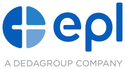
Introducing EPL’s New Corporate Logo
Say “Hello!” to EPL’s new corporate logo
Say “Hello!” to EPL’s new corporate logo and refreshed visual identity system. This is an exciting time both for EPL, and Dedagroup as a whole. They are not the same company they were just two short years ago, and their new look is the culmination of a period of transformation – transformation into a software development company that provides the most competitive financial products and best customer service in the market.
The new EPL logo better reflects both Group’s and Company’s forward-looking vision and innovative aspirations, pursued constantly by a team devoted to developing viable, affordable and savvy software solutions that improve customer profitability and enhance the user experience.
The Mark
The circular design of the mark points to the global perspective and resources brought to EPL by Dedagroup, while telling a deeper and more meaningful story. It is comprised of three elements that represent EPL’s three tenets – Evolve. Perform. Lead. – which are organized in a manner that empowers the viewer to visualize each individual letter of EPL within the circular mark itself.
The Payoff
The payoff – “A Dedagroup Company” – tells the world that EPL is fully integrated and aligned with the group, and a member of the Dedagroup family of companies. It gives further credence to Dedagroup’s confidence in EPL as its first U.S. partner, and is a second nod to the global perspective and resources the partnership affords.
This is the new EPL.

